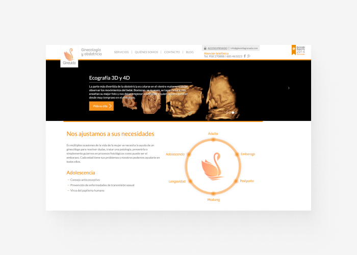
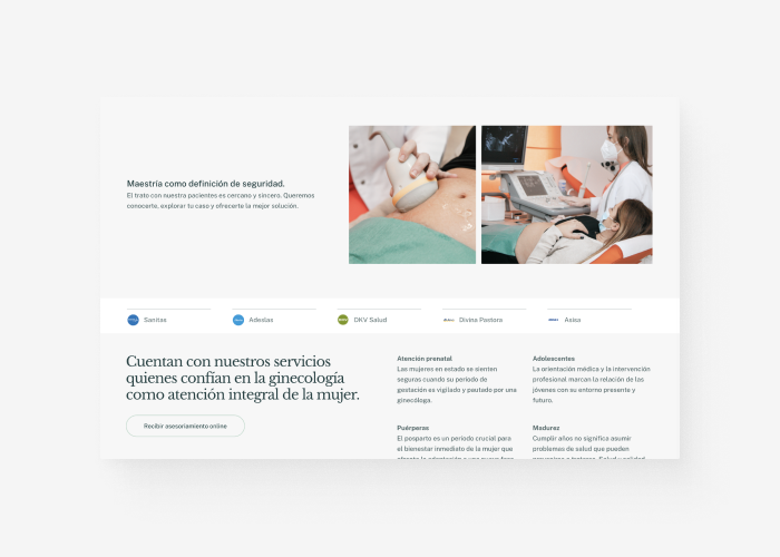
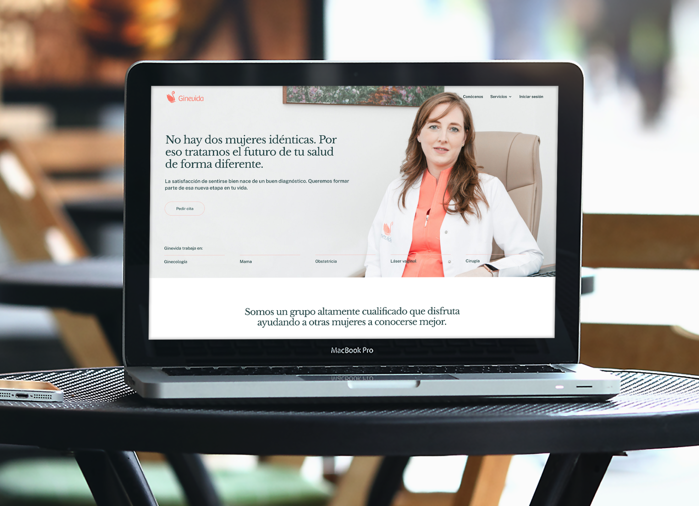
Overview of the project
-
500+Due to an accesible interface, patiens can register and use the site to establish more efitient communications and book an appointment.
registrations -
2-way-syncDoctor schedules sync seamlessly with Google Calendar, allowing bidirectional updates; changes made on the web app reflect in Google Calendar, and vice versa.
doctor's agendas -
19In addition to online services, the booking system is dynamic, guiding potential patients to select a service tailored to their needs. Responses are stored privately and monitored by healthcare staff daily.
services
The challenge
Although the client presented it as a redesign of the current website, I quickly realized that the real challenge was to lead patients of diverse ages and backgrounds through a seemingly complicated booking process. The website must provide multiple services to patients, delivered by various doctors on different calendars, creating an even greater challenge.


The approach
Dividing the redesign into various stages, with a primary focus on delivering a viable product launch that serves as the new brand design. Additionally, this product should have the capability to facilitate scalability and the integration of features that, over time, would distinguish the clinic for its ability to offer and manage online services effectively.
I envisioned a complex backend for the client, while introducing something new to customers the patients. I had to provide instructions to both parties without overwhelming them throughout the project.
It was key to establish and make the client reflect on the clues to ensure a successful product. In the future, we will examine analytics, but my role at the beginning was to listen to their expertise, identify their strongest points, and ensure they were ready to work with me to improve their online presence and follow my guidance.
A streamlined, efficient way to book from any device
Genevida's team and I worked together to create a booking system that was complex to build but simple and accessible for both patients and doctors. It integrates 18 services, always prioritizing a hassle-free booking process that benefits the patient.

Just a reflection of a highly qualified service
The foundation for creating a 360° website for this obstetric clinic was rooted in their service. The site aims to be both user-friendly and enjoyable. As someone with a passion for learning, I found genuine pleasure in hearing from healthcare professionals about their practices. The process involved attentive listening, days of reflection, and a dedication to shaping content that would be truly meaningful for their patients.
The Genevida team consciously avoided aggressive marketing tactics. Instead, their focus was on making it easy for users to find the information they need, when they need it.
To create a more favorable website experience for both the clinic's medical professionals and staff, we aimed to anticipate patient behavior based on age group, level of urgency, and specific expectations.
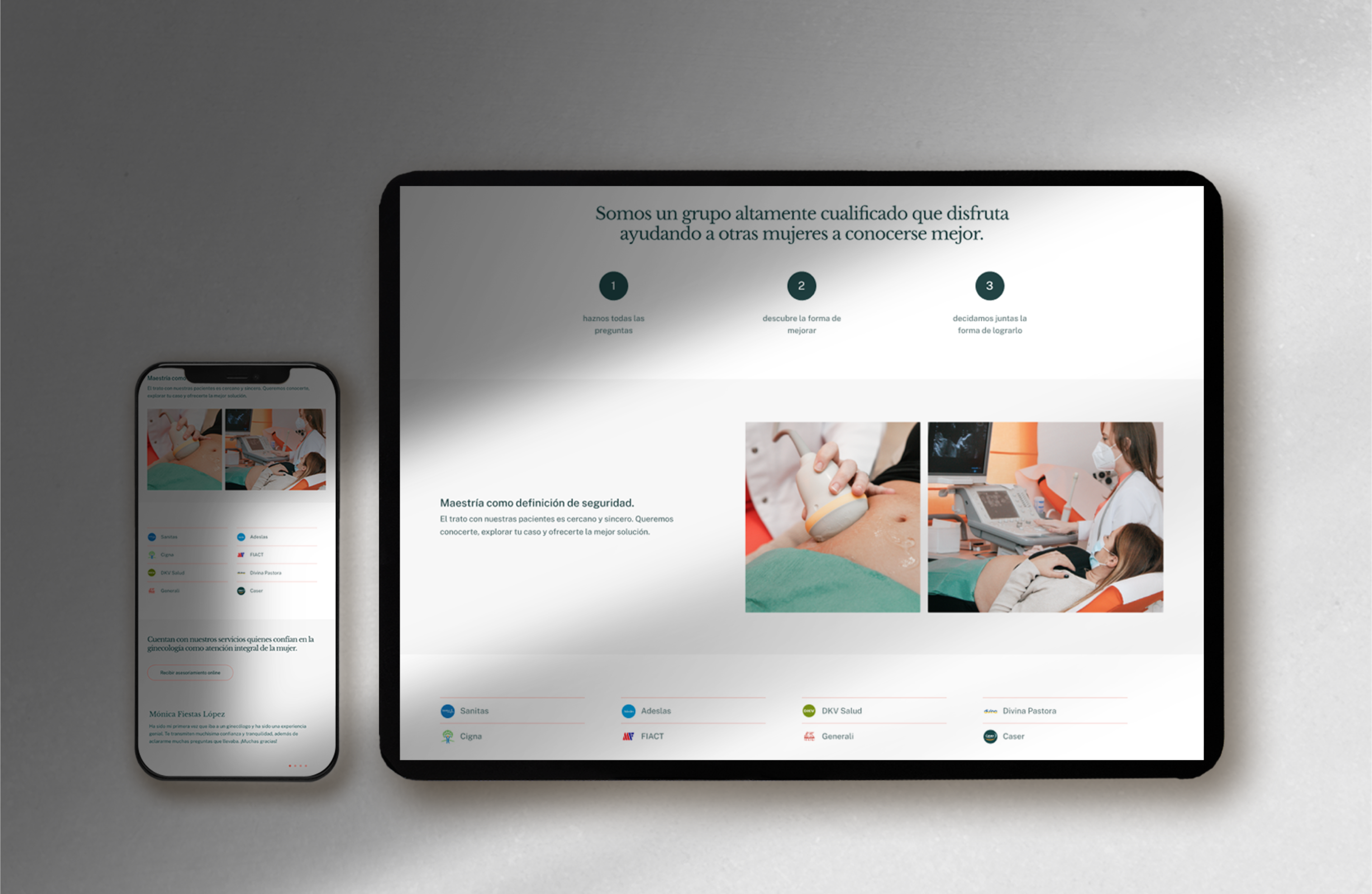
It's all about the user experience here in this website, and that's why we've taken a real mobile-first approach.
We've thought about how potential patients might book appointments—whether they're chilling on the couch after a long day at work, riding the bus, or just browsing on the weekends. We've tested and refined our approach over time, taking all that context into account to create a simple, user-friendly interface that provides just the right amount of information. And we haven't left anything to chance—every part of the website has been carefully designed, from the color choices to the content placement.

